Web Design
How Websites Make You Buy Their Products: It’s Smarter Than...
View Insight
Salvus House, Aykley Heads, Durham, DH1 5TS
Get a Quote
6th Jul 2017

“I don’t think there is anything wrong with white space. I don’t think it’s a problem to have a blank wall.”
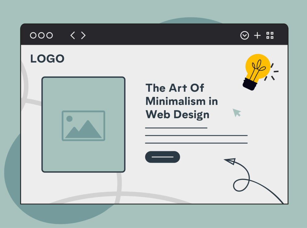
Whitespace has always been a controversial element of web design, with designers embracing the clean look and styling white space brings. However, to many website owners, white space is seen as nothing but a waste of space, one that could be used to promote their products, message or services more effectively.
In a time where we are surrounded constantly with endless information, having some whitespace acts as a breather for the viewer or reader, playing an important role in the visual layout and readability of your website.
When designers talk about whitespace, they mean the negative space that hasn’t been filled by other elements such as images, text, videos or any other screen elements. This refers to any space between elements, not just space that has been left ‘white’, in fact, whitespace can be any colour or texture.
When using white space in design it’s important that you make the most of it and use it effectively. There’s nothing worse than having too much whitespace or alternatively having too little. Instead, you should aim to use white space to create a clean, aired out look than can help your design elements stand out.
Whitespace is a fundamental element of design, used well it can transform a design and provide a number of benefits for not only the website owner but also the site visitor. Whilst some of these may only be aesthetic reasons, there are still a number of practical reasons why whitespace is so important.
The most basic reason for including white space within a design is that when used properly it can reduce the amount of text that visitors see at once, making it much easier to read. If a page looks too cluttered, not only does it look unattractive but it also can be incredibly difficult to read.
Whitespace can be a powerful way of drawing attention to certain elements on screen. Surrounding an image or piece of text with whitespace can be as effective as making an element larger when it comes to drawing attention to it and making the element appear more obvious.
The use of whitespace can be an effective way of communicating openness and freshness, making your website appear more elegant and high end. A perfect example of this is with Apple who uses lots of white space on their website and marketing materials, helping them appear as high end as their products.
Whitespace doesn’t only generate a balance with your website design, it’s also a useful and practical way of designing for your visitors, as a way to benefit them, letting you include information in a readable way, as well as making your site appear more simple and organised.
There’s no doubting that whitespace is a valuable tool when it comes to web design and with more and more websites appearing that seem to understand and utilise whitespace there’s no reason for the controversy it causes between designers and clients. Sure at first glance it can seem like a boring design style, making your site appear empty but when done correctly and surrounded by the perfect content it can change the whole dynamic of your website.
Our specialist team will provide a quotation based on your requirements
Get A Quote