Web Design
How Websites Make You Buy Their Products: It’s Smarter Than...
View Insight
Salvus House, Aykley Heads, Durham, DH1 5TS
Get a Quote
12th Jul 2016

Building a website can be daunting experience and there are many mistakes than can be made during the process. From design flaws to irrelevant content there are a number of factors you need to consider when creating your website in order to get it correct first time, saving you both time and money in the long run.
Before you can create your website, it’s probably a good idea to have a full understanding of what you shouldn’t be doing, which is why we’ve got 6 of the biggest web design mistakes you could make and how you can avoid them.
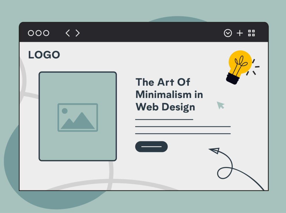
Site navigation should be seamless, your visitors should be able to find their way around your website quickly and easily without confusion, and whilst there aren’t specific rules for website navigation it’s important you feature great navigation on your website.
If your visitors can’t find out where they need to go on your website and find themselves struggling, then they’ll simply leave and go elsewhere, likely to your competitor. Featuring an easy to read navigation bar at the top of the page, which has links to other areas of your website is a simple yet effective way to help your visitors.

Whilst uncommon, some designers take it too far, creating website with different designs for each page, which is not only confusing to the user but also looks awful. Nothing screams “doesn’t know their business” like an inconsistent website design.
You need your website to look consistent on every single page, from the home page to your products to your contact page. Create something which sticks with your brand identity, if your website doesn’t look constant customers will think you aren’t in control and will leave as quickly as they arrived.
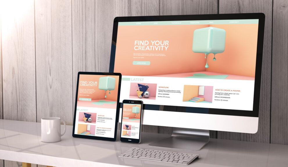
There are a huge number of devices currently available on the market each with their own different screen sizes. Gone are the days of designing for specific devices, now designers need to be designing your websites for screen sizes and resolutions.
If visitors are viewing your website on a mobile they still want the same great user experience as those viewing on a desktop. Designing your website with this in mind means you not only have a modern and up to date website but also leave your customers getting the best experience they can.
Too many people forget about white space and it’s importance. With many thinking that white space is a bad thing, it’s common to see people cramming as much onto a web page as possible in order to make the website look like it has a lot to offer, however the end result ofter has a negative effect.
These people are left with a busy, cluttered website, with too much information available. Customers want information and images but they also want to be able to read it clearly and without distractions. An overly busy web page does nothing but confuse readers and make them want to leave your website to find something better.

Just because a visitor has found your website it doesn’t mean they’ve found what they want, often people will want to search your website to find a specific item or service.
A search box is an essential part of your website, your visitors aren’t going to want to spend hours trawling through our website looking for something and it’s likely that if they can’t search for it, they won’t spend long looking, choosing to look somewhere else instead.
Your website needs to be fresh and up to date both in it’s overall design but also with it’s content. There’s no reason for your website to provide outdated content, your customers want current, relevant information, they want to know what your business is doing now, not what your business was doing 3 years ago.
Keep your content fresh, if you’re redesigning your website, then it’s time to change your content, update your customers, use a fresh tone of voice, having old, irrelevant information is a sure fire way to reduce your credibility and lose your customers.
One of the biggest mistakes you can make is not testing your website. You can’t know how well your website functions without initial testing and A/B testing. Testing allows you to know if your website can be viewed on all browsers, on all screens and in different settings.
If you’re not going to test your website, then your hard work might as well be ignored, not testing means your website may not be performing as well as you want, leaving visitors going to on which does.
Your business is only as good as your website, if your website isn’t good enough then people are always going to assume that your business isn’t good enough either and will look to your competitors for the service they want, don’t let this happen, follow these steps and you’ll be achieving success in no time.
Our specialist team will provide a quotation based on your requirements
Get A Quote