Web Design
How Websites Make You Buy Their Products: It’s Smarter Than...
View Insight
Salvus House, Aykley Heads, Durham, DH1 5TS
Get a Quote
4th Jul 2016

When it comes to the design of your website there are a number of different opinions on what constitutes as a ‘great’ website, with some believing that the design of the website doesn’t matter and functionality is key and others believing that the design is everything.
However if your website isn’t both functional and attractive it’s likely you’re not going to generate business. In order to find this balance, it’s important you don’t commit any of these deadly design mistakes when it comes to your website.
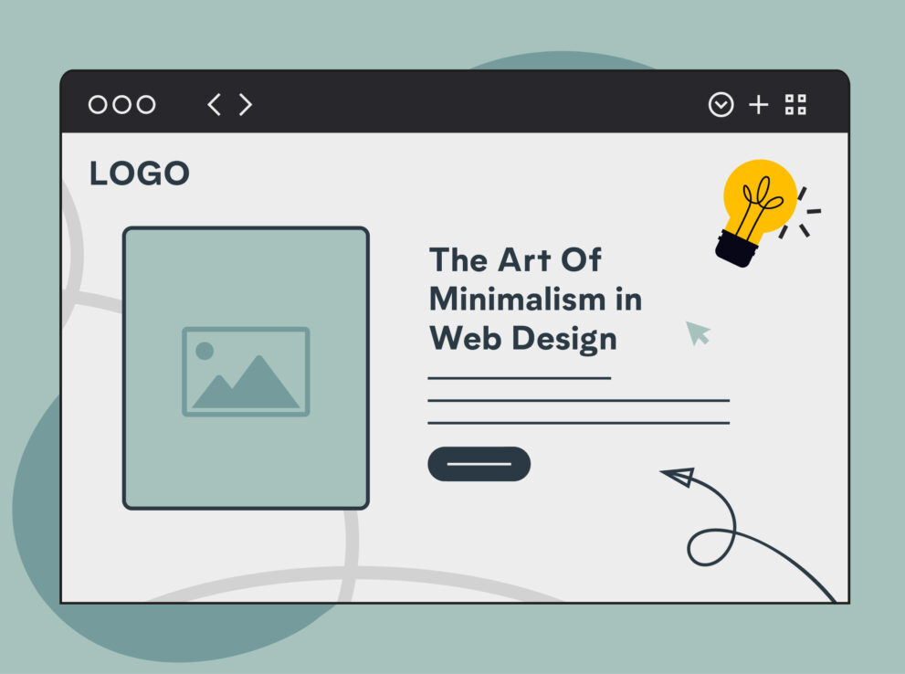
A small font size is a common mistake made by some web designers, but it really shouldn’t be. Your font for main content should always be large enough for your visitors to read and understand and should be the first thing they read before they read anything else on the page. Whilst a small font might look pretty, it’s generally not functional and surprisingly can have a large affect on your business.
A cluttered website won’t convert, when it comes to your design, you need a clean, uncluttered and easy to navigate website. If your customers can’t understand your website then they aren’t going to stay around for long enough to understand your business either.
Your customer is important for not only your website but more importantly your business. This is why it’s vital that your website is designed with the customer in mind. Creating an easy to use, organised website which provides your customers with relevant information is key when it comes to creating a website to engage your visitors.
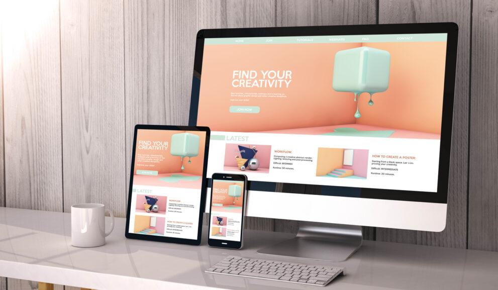
It goes without saying that mobile browsing is just as important now as desktop browsing, with more people than ever choosing to browse the internet using mobile and tablet devices, in 2016 you need to have a responsive website. Having a website which can adapt to a range of screen sizes could be the change you need to make in order to reach new audiences and generate leads.

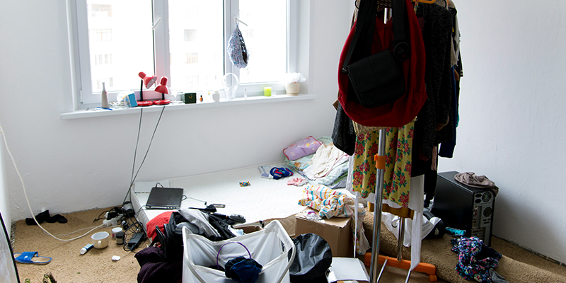
Whilst there’s nothing wrong with stock images, there’s a slight problem when it comes to cheesy, almost comical, stock imagery. The classic woman in a headset, business men shaking hands, women laughing at salad, you know the type. Your customers don’t want to see these images, they want photos of your product or service, or at least relevant stock imagery which enhances your website, instead of lowering the tone.
Web design is constantly evolving, what looked good a year a go might not be current this year so it’s a good idea to keep up to date. Having an out of date website can instantly turn potential customers away as it can lesson your credibility and make your business seem old and out of touch. Keeping your image and text content up to date is a must if you want o generate new customers.
Why anybody would consider using Flash on a website these days is beyond me, but if you were in the minority to do so, don’t. Whilst it’s true that Flash used to be common practice even amongst the top sites, we’ve come a long way since then. Nowadays customers want to be found online with SEO, which you can’t do with Flash, so if you want to get found, stay away from a Flash website.
Users should be excited to visit your website and encouraged to return, which should be your main priority when designing your website. Avoiding these 7 sins and offering high quality information, a responsive design and a clean layout should not only keep your customers coming back but also welcome new visitors to your website.
Our specialist team will provide a quotation based on your requirements
Get A Quote